Each day we go over loads of webpages and most of these pages are of our favorites for some certain reason. Did you realize that the first thing we care for before getting accustomed to visiting a website is its easiness of use, and naturally its readability ?
I sometimes encounter such poor colors and fonts on some websites I visit, and I can't help but skip the site, no matter the content's utmost quality. While numerous details of different nature such as the site being designed for user experience, having high-quality content, not being packed with ads and notification boxes significantly affect the time visitors spend on a site; the concept usually overlooked is the font and the color harmony that makes the site readable. It might sometimes be that a color combination or transparency level that looks pleasant to the eye can be totally destroying the readability. You should be designing the site not solely based on your own choices, but the millions (which is your target, right?)that would visit.

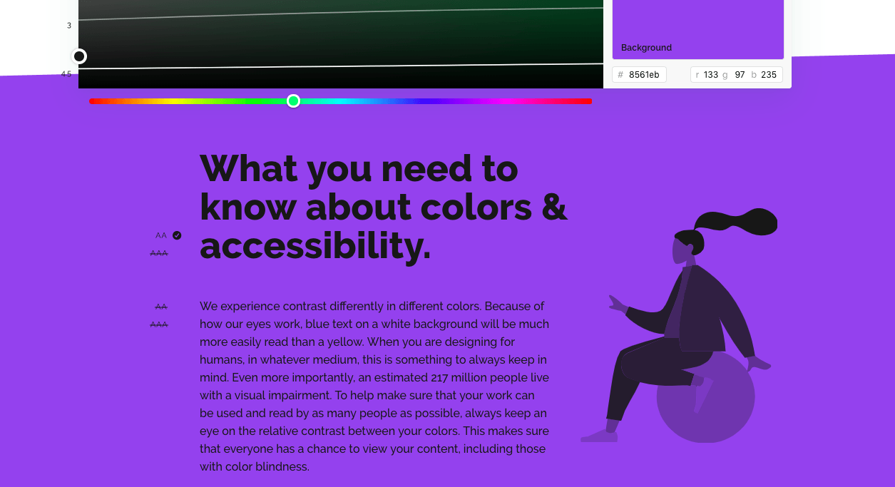
Many people around us have various eye problems though we might not notice that at all. Hence, you shouldn't dismiss issues like the color, transparency and font for readability along with a pleasant outlook while designing your website. Moreover, you might as well choose to use the color blue instead of using yellow on a white background, since the recognition of color often is rather difficult due to the mechanism of vision.
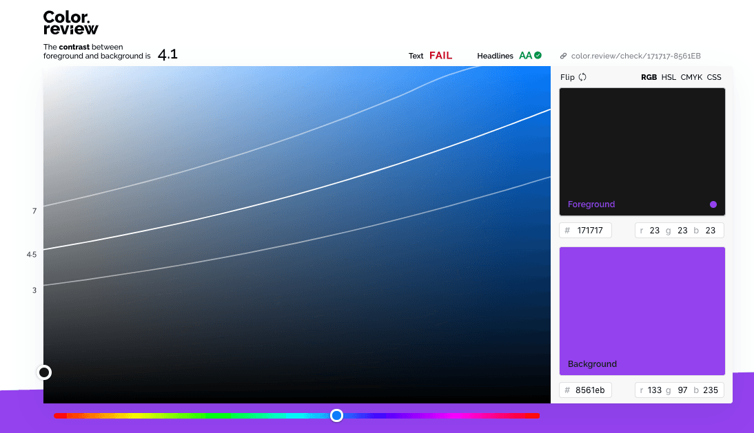
Color.review, is a project aimed at highlighting, and of course offering a solution to this problem. It aims at allowing you to perfectly adjust the contrast between the space you want to highlight and the background, which in turn would make your site readable to everyone. Plus, it allows you to have alternative harmonies of color, thanks to its ease of use.
The developer of the programme, Anton Robsarve states that 8% of all the men experience a certain kind of color blindness. Assuming the existence of a similar ratio in women; overlooking color matching on your site would mean that you'd be ignoring, or even losing at least 16% of your followers. Why losing followers while you can solve the issue with a simple tool?


Would you like to write the first comment?
Login to post comments